Over the last year, countless institutes and organizations have put out reports diving into all manner of areas related to education and teaching. While such reports naturally give prominence to their recommendations and conclusions, some of the most interesting snippets and findings can get buried in the course of the arguments.
Many of the statistics below aren’t necessarily new or earthshattering, but they serve as a reminder of some of the big problems facing the teaching profession, and why they remain unsolved.
Chart #1: Why Teachers Leave Teaching
The teaching profession offers the chance to mold the next generation of American workers, but also contains well-documented drawbacks. According to acclaimed researcher Richard Ingersoll, a professor at the University of Pennsylvania, the day-to-day working conditions of teachers, in terms of both the workload and preparation time, create the biggest headaches for educators:

But other problems persistently nag at teachers, too. The sources of frustration seem evenly balanced between district-level management, school administration, and students and their families, though the largest problems seem most directly influenced by district leadership.
Chart #2: What Goes Down Doesn’t Come Up
The majority of states are funding schools below the levels reached a half-dozen years ago, before the Great Recession caused significant budget cuts. This chart, from the Center on Budget and Policy Priorities, shows that lower funding is the new normal for many states, even those which have ostensibly recovered from the recession.
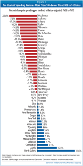
You might notice at least one trend: The colors of the bars tend to represent the political leadership of each state, though not perfectly. North Dakota also seems like an outlier, but it was also the only state to survive the recession largely intact, in part thanks to an energy boom.
The amount that states spend on education has obvious and direct effects on teachers, not just because of salaries, but because finances can determine class sizes, school resources, support staffing, and course offerings.
Chart #3: Teacher Autonomy
Speaking of North Dakota: According to a Center for American Progress survey, teachers in North Dakota have the most autonomy in terms of classroom control of any state. In this regard, the gaps are huge between North Dakota and states ranking near the bottom, including Virginia, Rhode Island, and Delaware:

South Dakota finished a close second, but also offers some of the worst teacher salaries in the country.
Chart #4: Finding the Best Curriculum
The acquisition and use of a good curriculum weighs heavily on teachers, and for that, they often turn to each other. According to an August poll conducted by the Education Week Research Center, teachers overwhelmingly trust each other for determining the best curricular material, versus independent panels or publishers, at least insofar as whether the material aligns with common standards:

Finding good curriculum, especially that kind aligned with the Common Core State Standards, continues to be an elusive goal for many teachers.
Chart #5: Working Together
To hammer a point home (again), teachers like each other. In a survey of state teachers of the year conducted by the National Network of State Teachers of the Year and the American Institutes for Research, participants pointed to the virtues of working with other teachers, saying that collaboration plays a central role in their development.

And yet, it’s also often clear that creating additional collaboration time does not constitute a priority—or perhaps even a possibility—in many schools. Where schools do emphasize collaboration and other forms of theoretically effective professional development, however, there’s no guarantee of quality implementation.
Chart #6: Slow Salary Growth
Salary continues to be a thorn for many teachers, and many reports point to the need to increase teacher salary. A report by the National Center on Teacher Quality shows wide differences among urban districts in terms of teacher salary growth over time:

Chart #7: International Comparisons
It turns out that it’s not hard to find a chart depicting the slow growth of teacher salaries in the United States. This one, from the Center for American Progress, shows that elementary school teacher salaries have grown just a little more over the last 15 years than for teachers in Slovenia and the Czech Republic, all well below the average for developed countries:
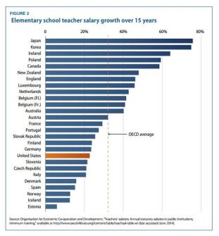
Chart #8: Working Hard or Working Really Hard?
But U.S. teachers aren’t lagging behind their peers in developed countries in all areas! With the exception of Argentina and Chile, U.S. teachers work more hours per year than any other country, according to the Organization for Economic Co-operation and Development:

“Number of hours worked” is a bit of a problematic claim; this chart is specifically about teaching hours, but non-teaching hours can still count as work. By other measures, teachers in England actually work seven hours a week more than American ones. (But both groups still work more than 40 hours a week.)
Chart #9: Retaining Minority Teachers
Long hours, inadequate pay, low salary growth, and low in-school support for collaboration? Sounds like a dream job! Who is becoming a teacher, anyway? According to CAP, mostly, it’s white people:

Hispanics are probably the most underrepresented ethnicity in the classroom, based on population. But the chart doesn’t reflect the fact that minorities have actually shown significant increases in joining the teaching profession; the problem, as Richard Ingersoll has also shown, is that minorities also leave the profession at high rates.
Read more of Education Week‘s end-of-year coverage.
